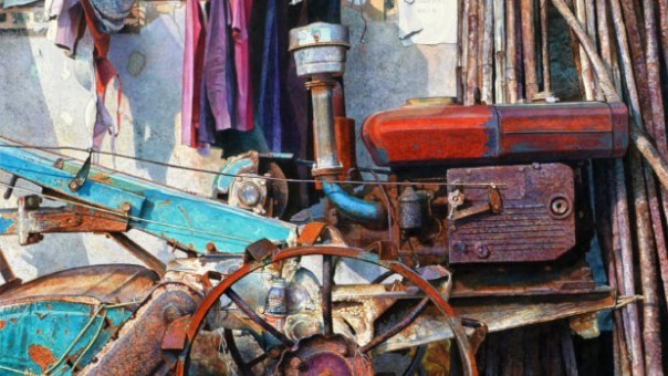
Created by the collaboration of the Society of Scottish Artist and Visual Art Scotland, this exhibition promised to be the ‘largest and most diverse exhibition of contemporary art in Scotland’. Such promise of scale and diversity are certainly held up as the show puts together a heterogeneous body of artworks and artists, exploring the most various themes through the most different mediums. Thus, by a curatorial perspective, creating this exhibition was an ambitious task.
This exhibition has the amazing ability of providing in the span of seven rooms a comprehensive snapshot of the Scottish contemporary artistic panorama in its kaleidoscopic facets. The diversity of the show is certainly among its strongest assets as it increases its chances of becoming engaging for a wide range of visitors drawn to certain artworks because of their themes, styles or medium. To keep faith to their promise of grand-scale, the massive walls of the Royal Scottish Academy are crammed with artworks creating a fast-pace exhibition which risks over-saturating its audience. Evidently aware of this issue, the curators kept the captions to a minimum on the walls, adding little more in the catalogue. This minimalistic approach certainly has its perks as it answers to the exhibition’s necessity and it enhances the visual experience pushing the visitors to rely less on scholars’ judgements and more on their own. Point of remark goes to the extremely accessible price.
However, the large scale, the diversity of artworks and the fast-pace visit brought forward by the curatorial choices have also their downsides. Personally, this show lacked depth as the grandeur and contemplative environment of the RSA spaces could not make up for the window-shopping effect caused by a series of issues. The curators, facing such large and diverse body of works, arranged the display following in the majority of cases an aesthetic principle: grouping artworks exploring different themes and through very different media next to each other.
Although, this created an extremely soothing effect which furthers the visit smooth flowing; it had the negative result of flattening the experience of art to its mere display and aspect. The dry accompanying text provided and the display of a practitioner’s isolated artwork in a series of aesthetically similar ones obstructed me to engage in depth with the practice of any specific artist. Further criticism was the disorganisation of the catalogue of which creation seemed completely disconnected to that of the exhibition space as the layout did not match the room sequence becoming only reason of confusion during the visit. Regarding the awkwardly positioned captions- readable only by assuming uncomfortable poses- I give it the benefit of the doubt by hoping their below-the-waist location was purposefully decided to make it accessible to wheelchair users and children. Certainly inaccessible, though, are the minuscule characters used for the captions.
Possibly, due to the goal set by the exhibition, this show was intrinsically problematic. Sadly, due to the compromises made to keep up to such aims, the exhibition failed in highlighting and communicating the superb practice of some of the hosted artists, which blended and got lost in the multitude of others.
- Backbone @ Underbelly Bristo Square - 23rd August 2019
- Goliath in the Water @ Assembly Checkpoint - 22nd August 2019


